Description
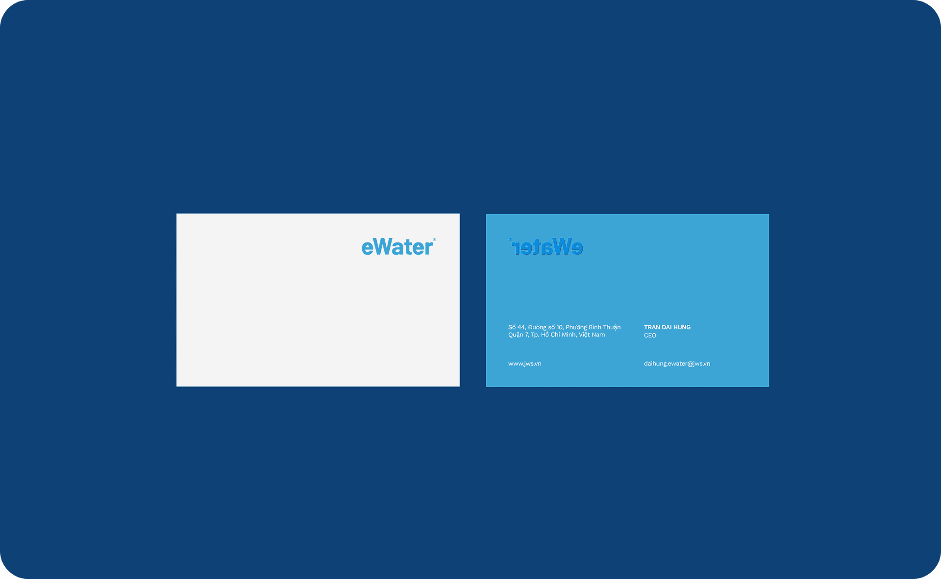
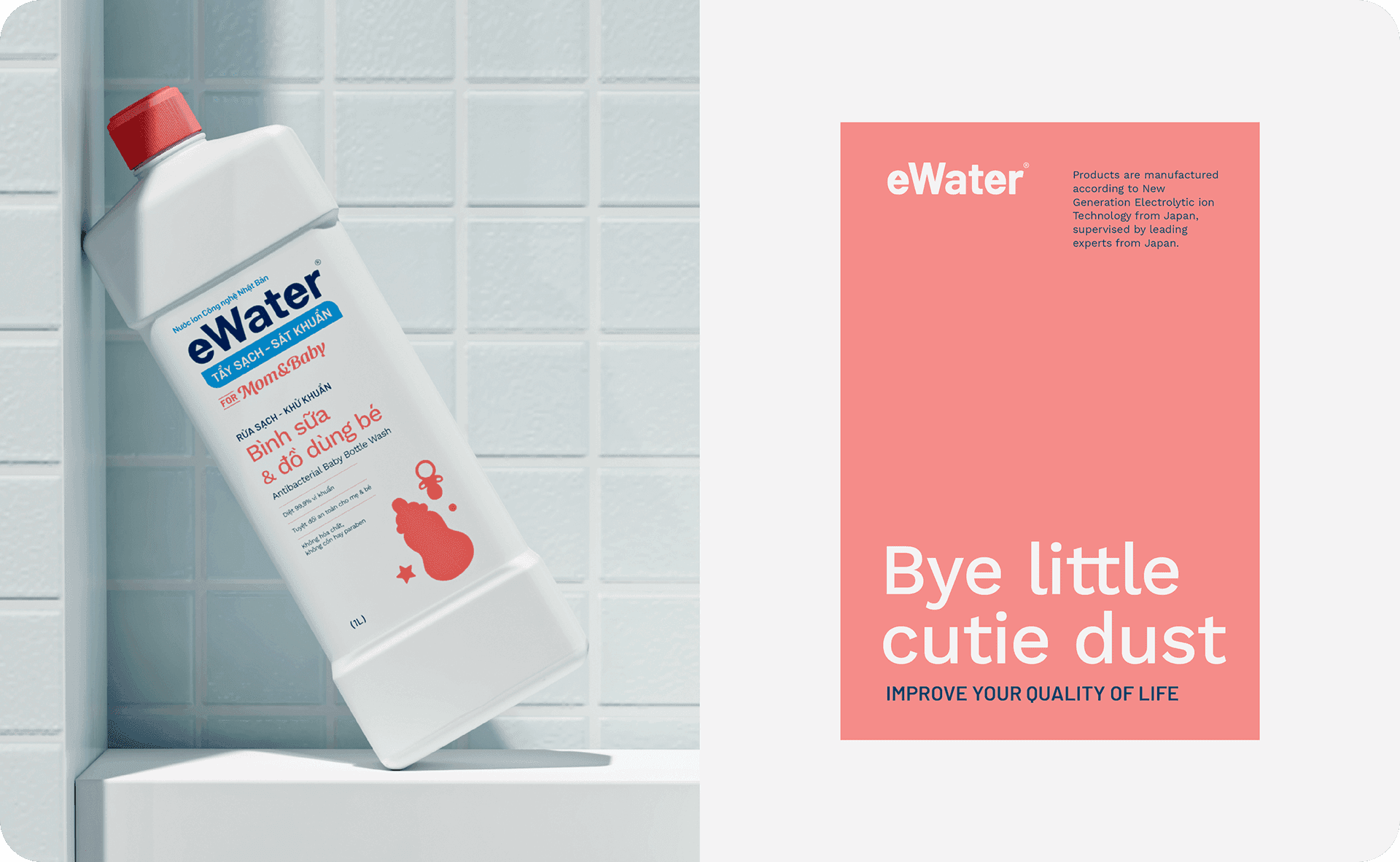
In the process of rebranding, our primary objective was to fashion a logo that not only reflects modernity but also exudes strength and confidence, encapsulating the essence of a prominent and esteemed entity. Leveraging the innovative ionic components derived from Japanese technology, our graphic elements are thoughtfully curated to convey simplicity and sophistication, drawing inspiration from the refined lifestyles prevalent in Japan.
Rationale
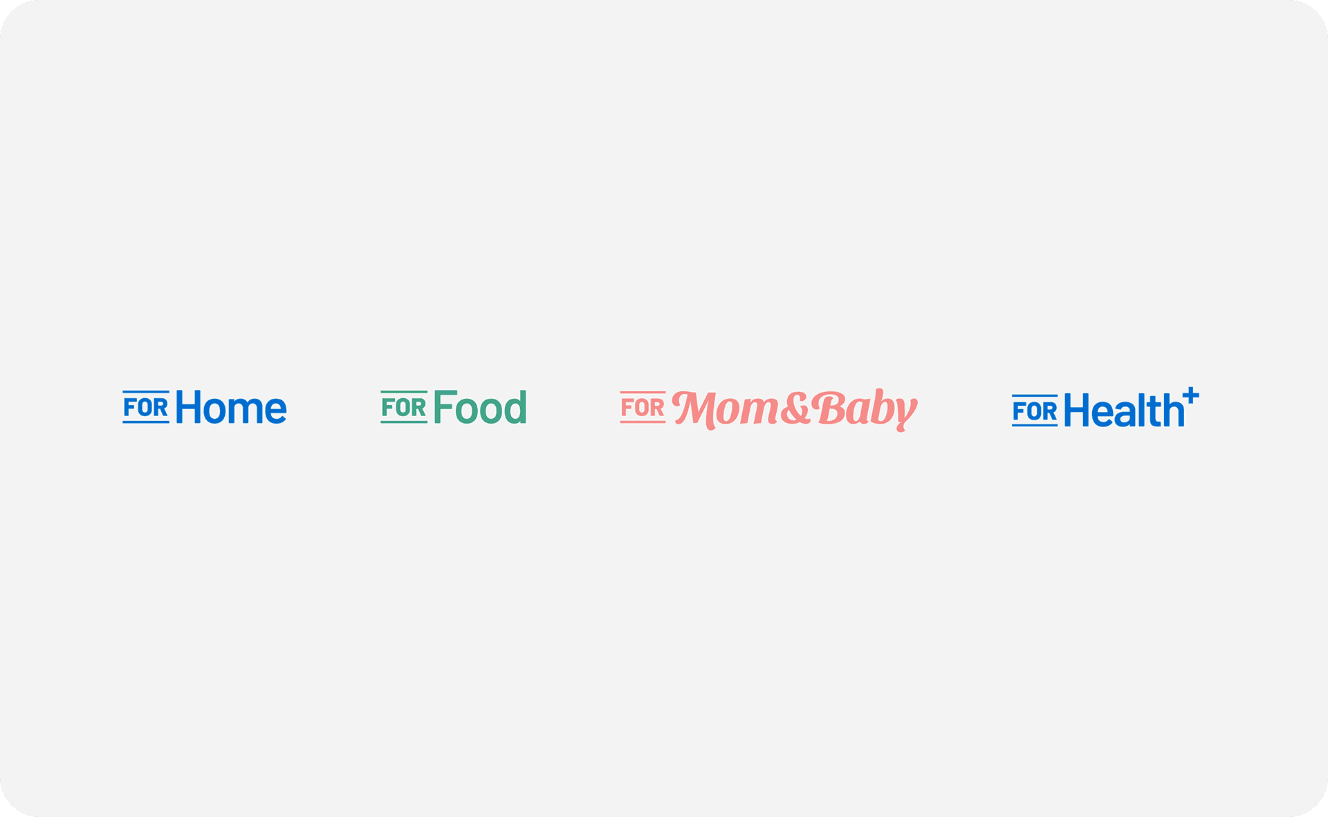
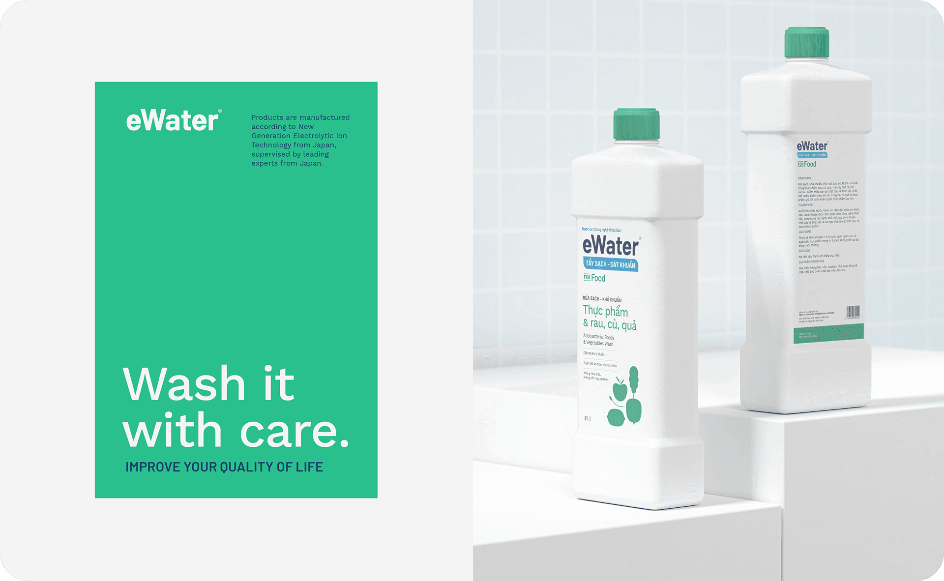
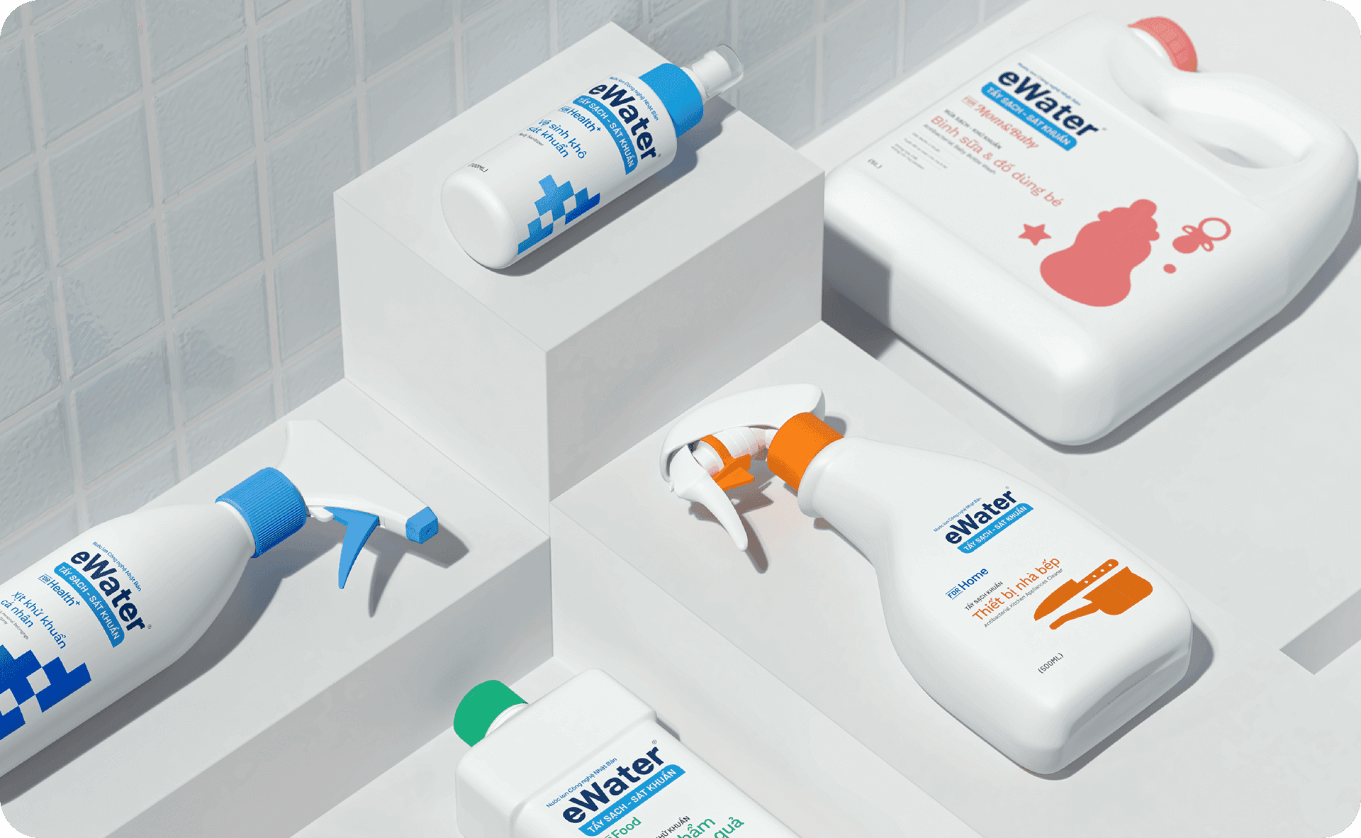
Our strategic focus revolved around the development of a comprehensive packaging series within the eWater brand, meticulously curated to embody the esteemed perception associated with medical-grade antibacterial solutions. With a target demographic comprising individuals aged 35 and above, whose paramount concern is safeguarding the health and well-being of themselves and their loved ones, our design endeavors to accentuate the product's innate protective attributes. Through extensive research and analysis, we intricately wove the theme of clarity akin to pure water into our design ethos, thereby ensuring that our visual representation exudes an aura of reliability, trustworthiness, and unwavering efficacy.