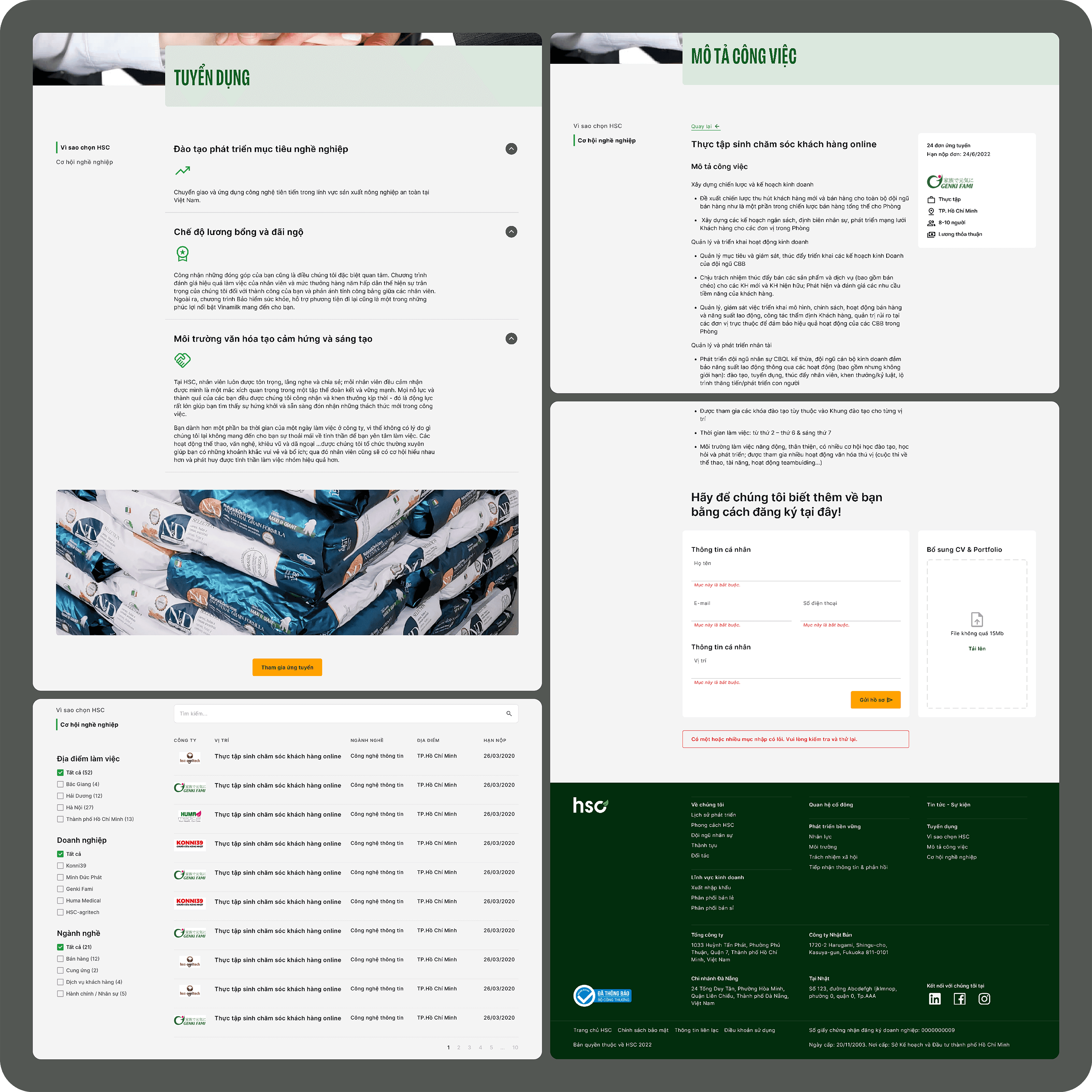
Round 1
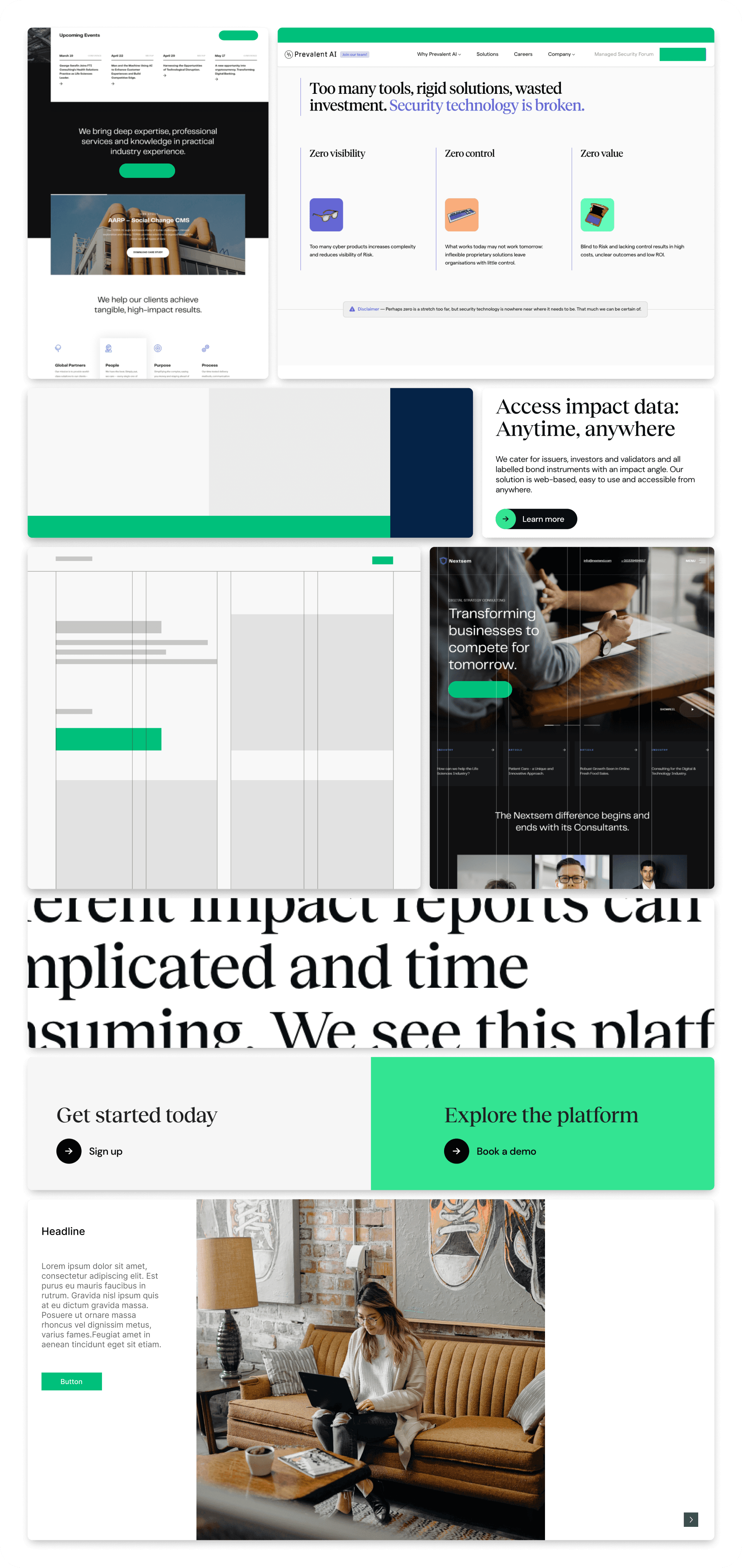
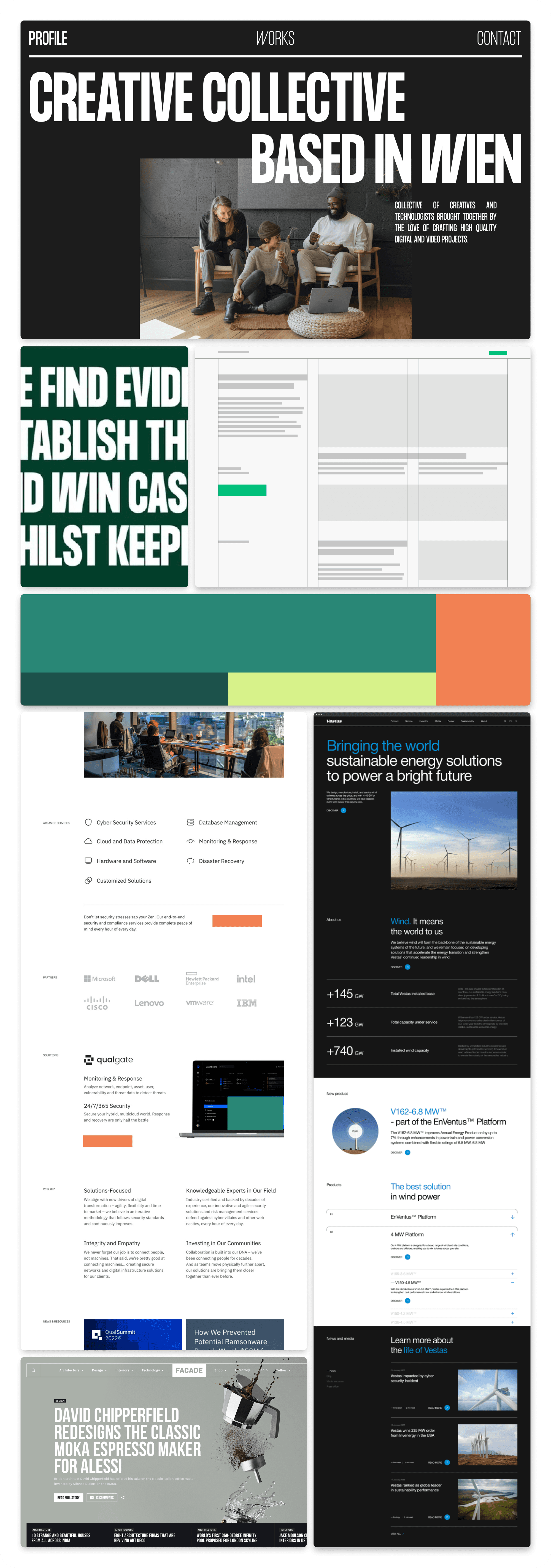
We propose visual direction moodboards, as well as design style, color scheme, grid system and layout.
Visual direction 1
Visual direction 2

Visual direction 3
Round 2
Following a thorough discussion and receiving valuable feedback, both our team and the client reached a mutual agreement on proceeding with Visual direction 3. Subsequently, we delved into suggesting various font combinations that aligned seamlessly with the chosen visual direction.
Font combination 1

Font combination 2
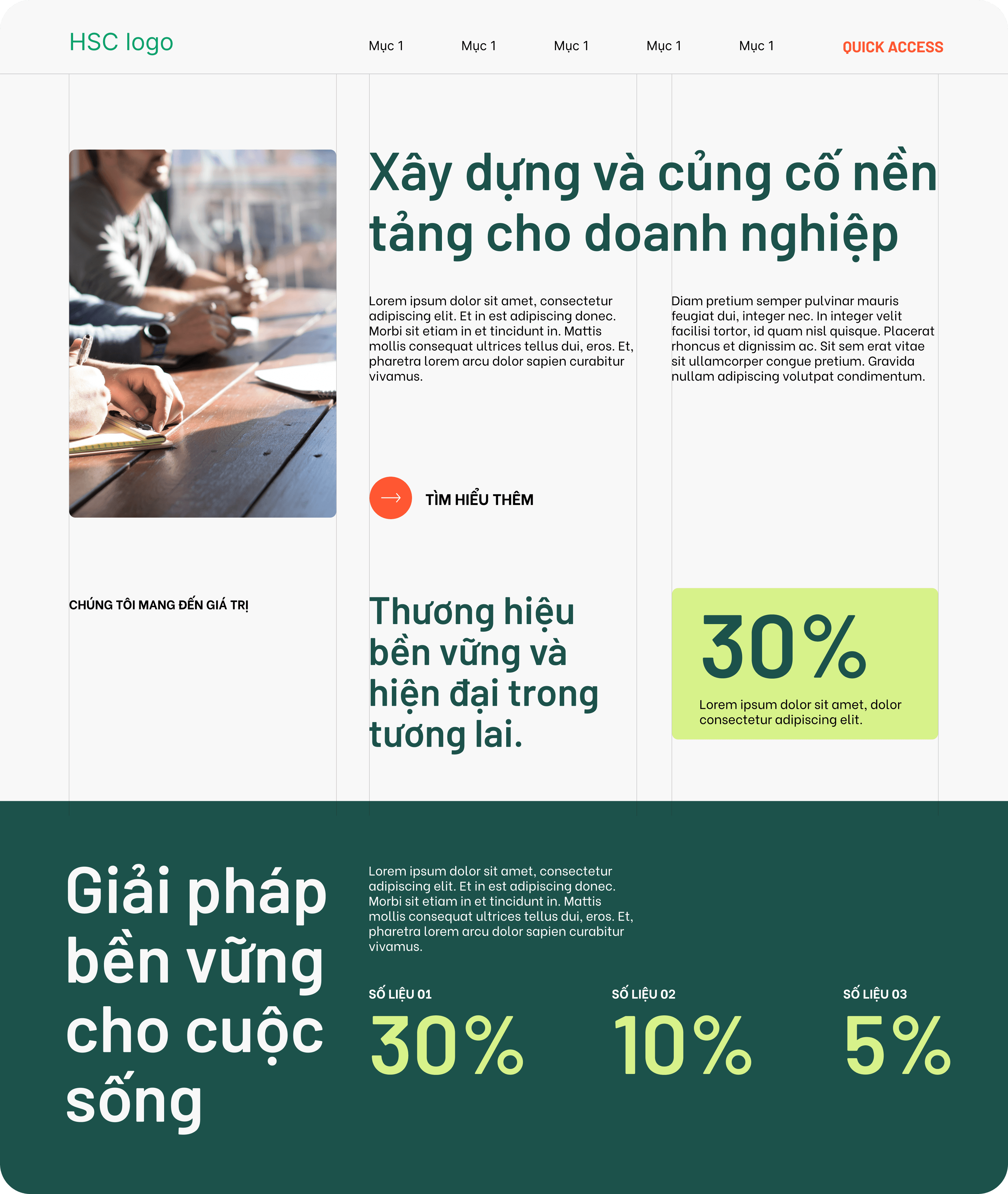
Font combination 3

Round 3
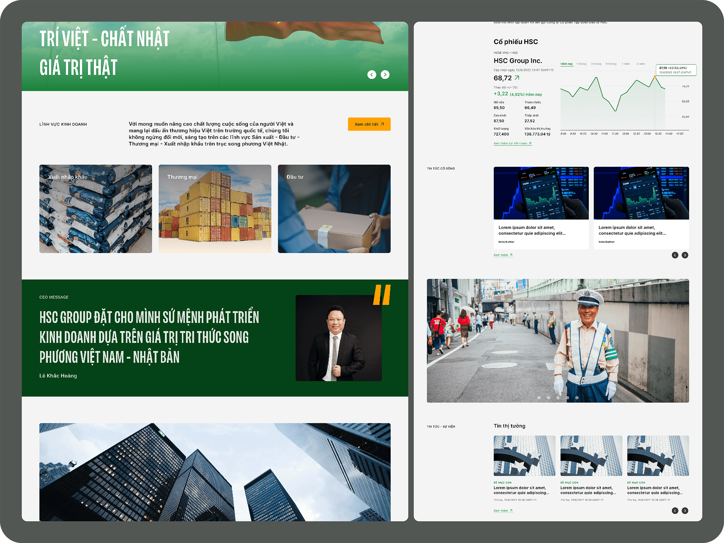
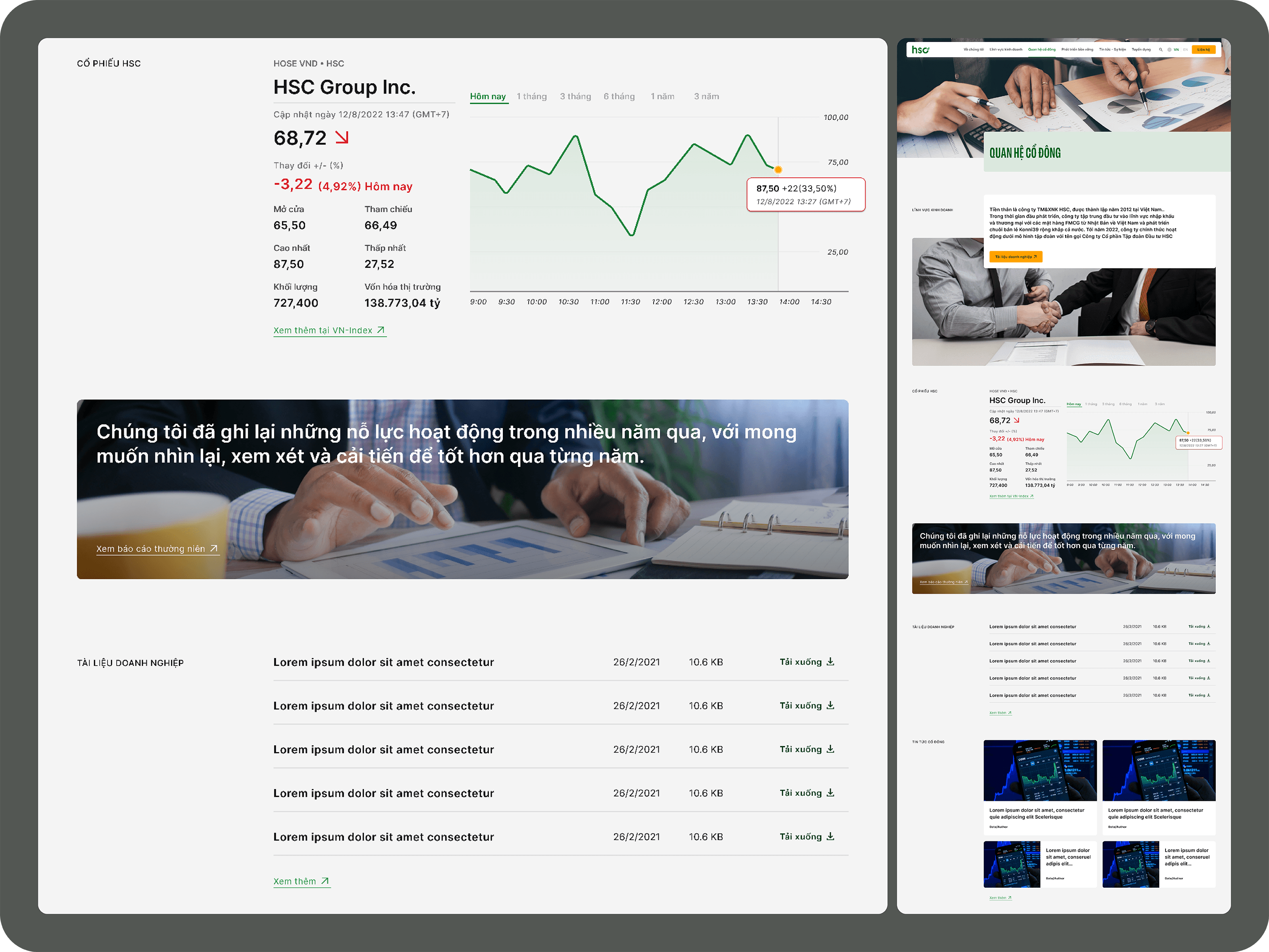
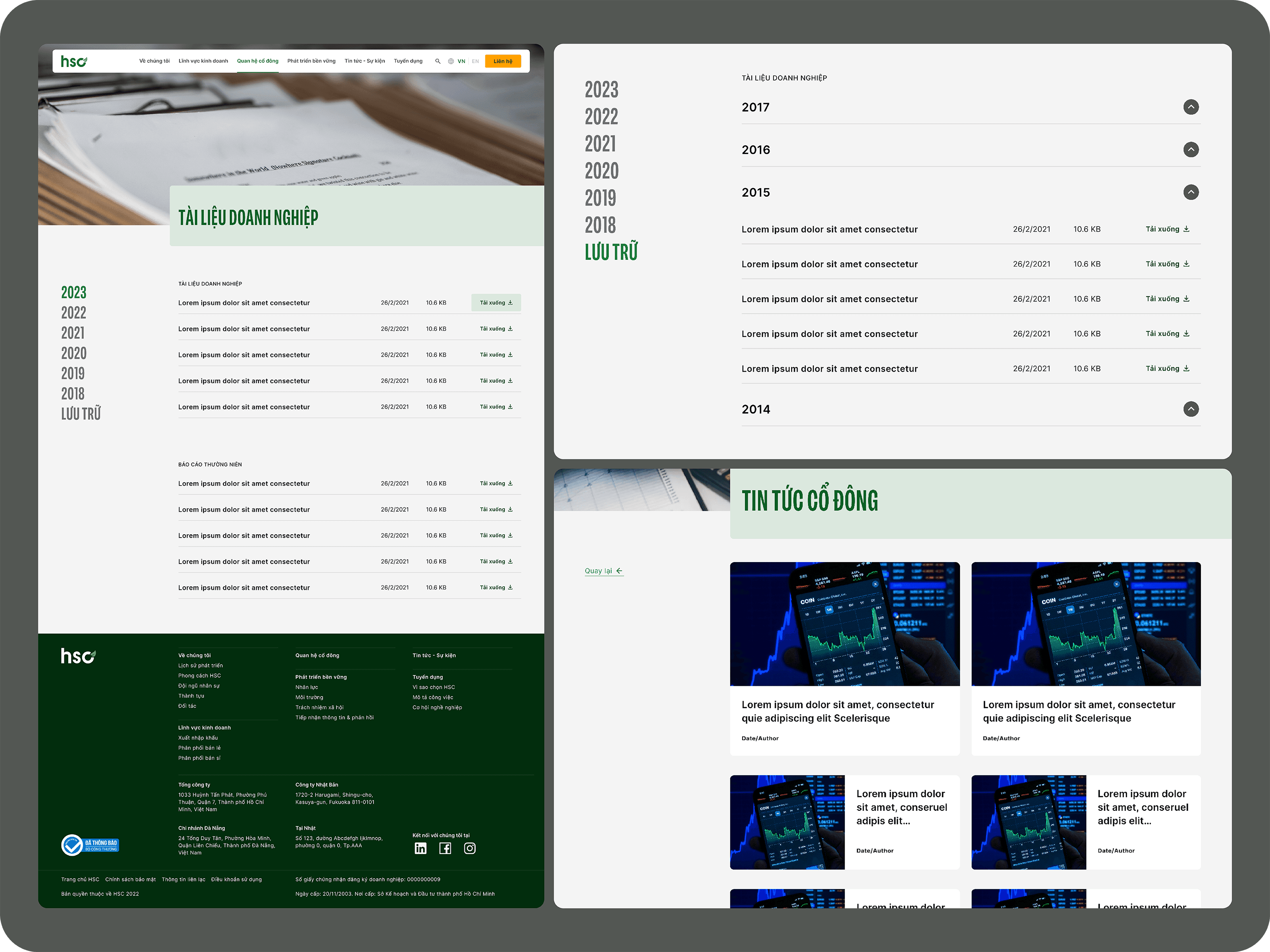
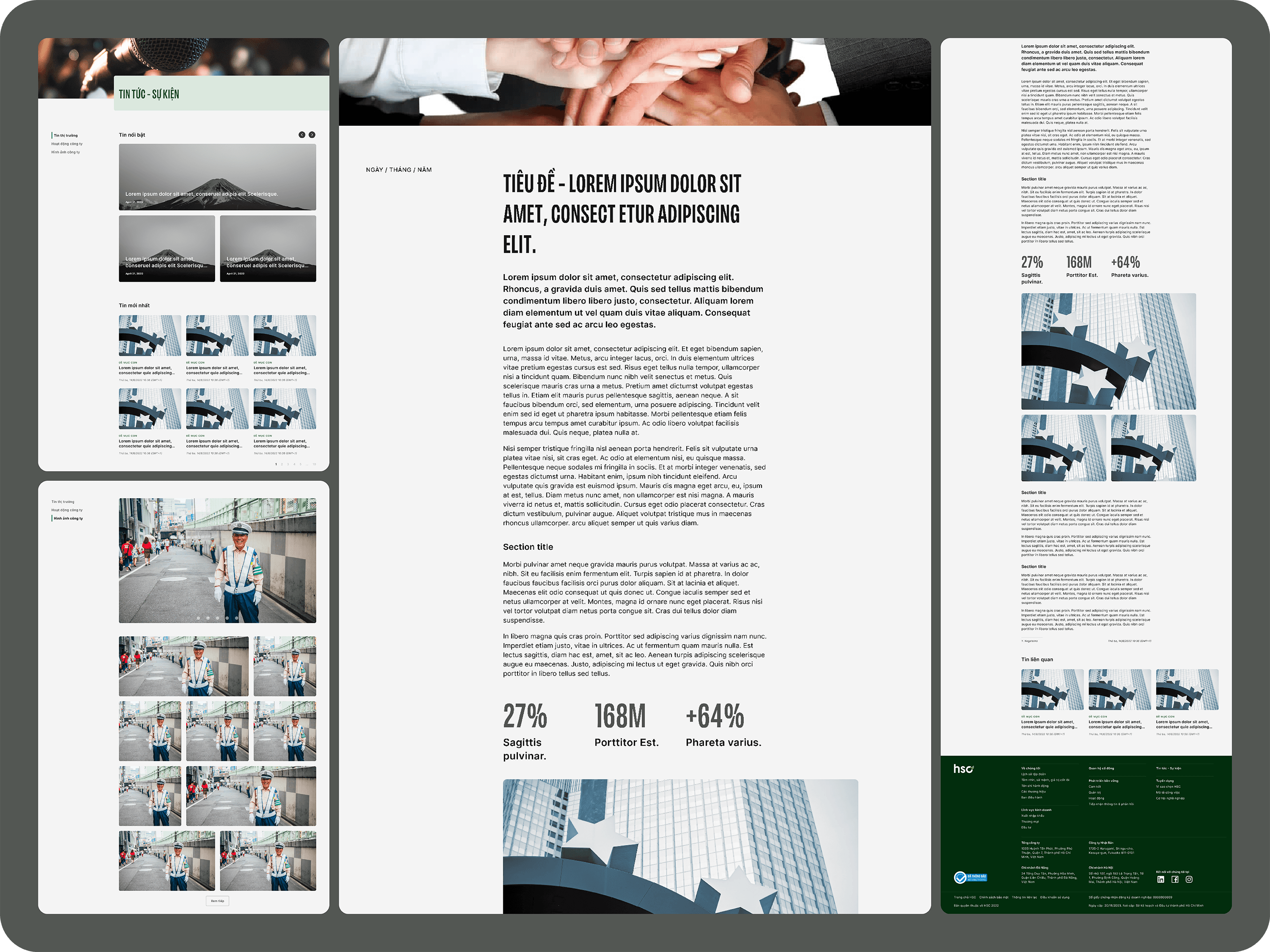
Through multiple rounds of feedback and fine-tuning, starting from wireframes to various prototypes, the screens of the website were crafted. Our team collaborated closely with the client's team, ensuring that the design not only captured the essence of the brand but also met the desires of the customer.
