Understand the audience & objectives
Strategic brilliance is at the heart of Xiangqi, with each piece having unique movements and the game emphasizing positional play. The "General" is central to the game, and its checkmate marks the end of the match. The Elephants, Horses, Chariots, Cannons, and Soldiers, each with distinct movements, contribute to the intricate dance of pieces across the board.
Strategically placing emphasis on the youth aspect of the championship, the design inspired by a young generation of players. The choice of colors, typography, and visual elements was a deliberate effort to convey not just the competitive nature of the tournament but also the vibrant energy and excitement that the young participants bring to the chessboard.

Define key visual & illustration
The key visual seamlessly blended traditional elements with a modern flair, symbolizing the harmonious coexistence of history and innovation within the game.
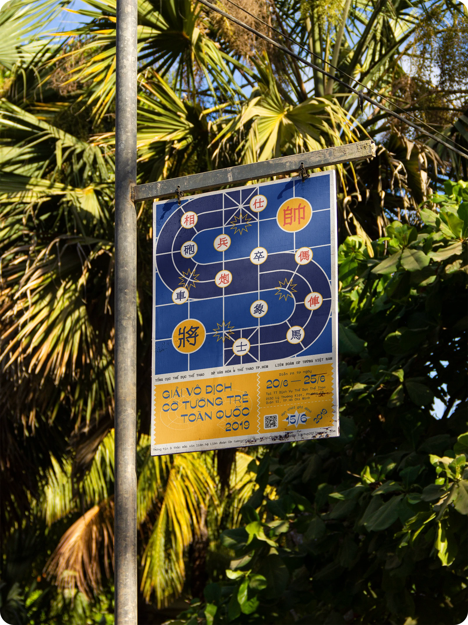
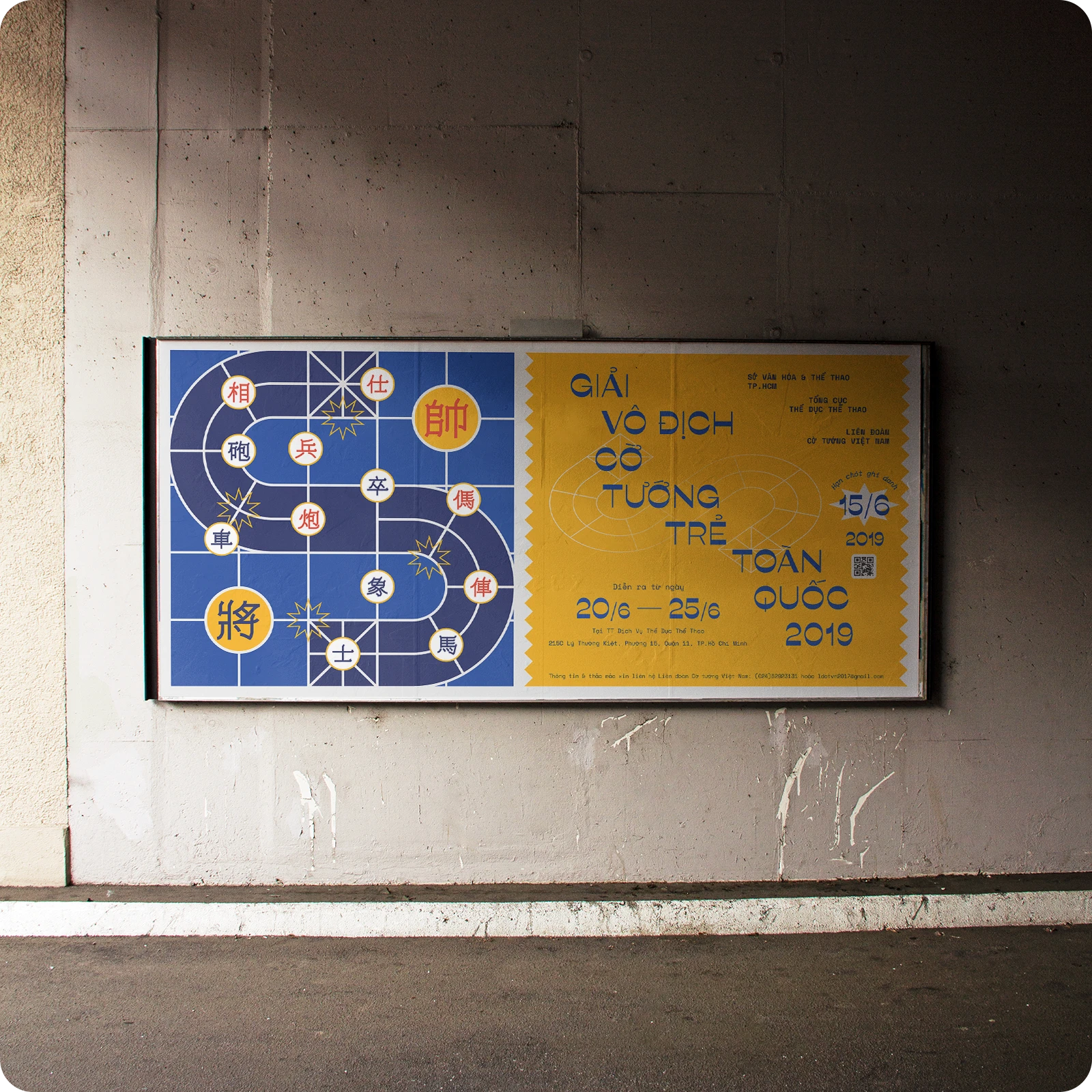
To convey a clear and visual message, I decided to use an image of a chessboard with pieces in play. Instead of drawing a boring chessboard, I aimed to make it more interesting.
Since this is a national-level competition, it’s an essential element to showcase in the key visual. The chessboard has two opposing sides, separated by a central river. I noticed a geographical connection to Vietnam. I curved the squares on the chessboard into an “S” shape, symbolizing Vietnam. This also represents a nationwide competition organized in Vietnam. Next, I randomly placed 14 chess pieces on the board, representing participants from all over Vietnam. The two largest pieces symbolize the winners. The ten-pointed stars represent the excitement, competition, and passion of the players.
To align with the design intent, I drew the chess piece characters that using only 1 stroke width, ensuring readability and recognition compared to traditional characters. I chose the “Ribes Black” font, which features uppercase round form letters as C, G, O, Q with thickness and high contrast, evoking thoughts of chess. Additionally, it brings a fresh appeal suitable for a younger audience."

Layout and composition

Finalize & adaptation for different format