Researching & understanding the book:
Firstly, I studied Homer’s epic poem “The Odyssey” to gain a clear understanding of its content, plot, and essential elements. This helped me identify the aspects that needed to be reflected on the book cover. I delved into the symbols, characters, and challenges within the story, from Odysseus’ journey to encounters with gods and mythical creatures.
Conveying the message:
A book cover is not merely a visually appealing image; it also conveys the essence of the work. I determined that the cover should reflect Odysseus’ adventures, hardships, and triumphs as he strives to return home.
Illustration:
“The Odyssey” is widely renowned and spans various cultures and eras. I aimed to avoid common approaches seen in other book covers. For instance, I considered elements like Odysseus’ ship, the vast ocean, and even a portrait bust of Homer.
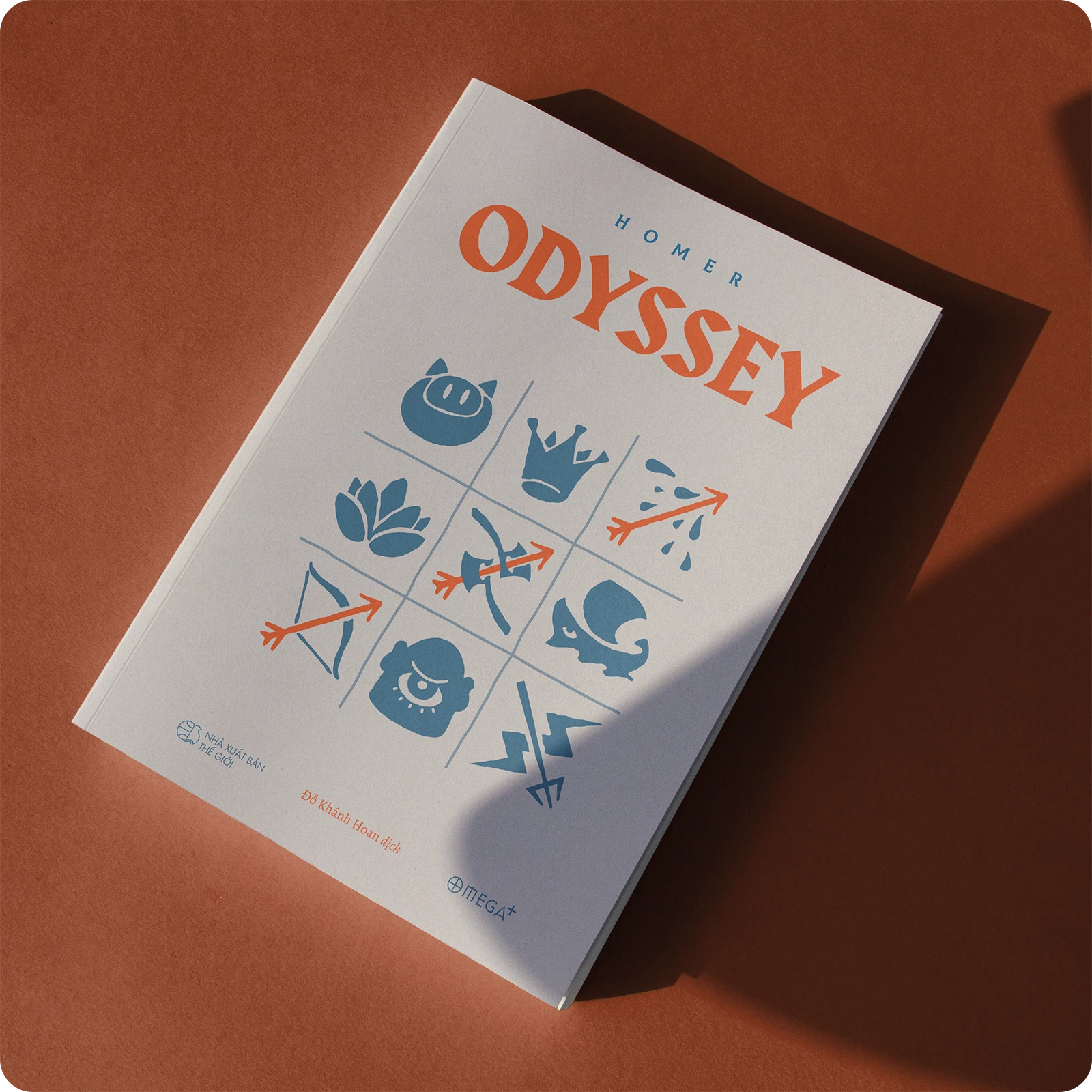
The central illustration on the cover represents crucial elements from the story. In this case, I used a metaphorical depiction of Odysseus’ journey across the sea and the perils he faced. The tic-tac-toe game also symbolizes his victory—much like his epic journey. To address this, I incorporated Odysseus’ weapon, the bow, with three consecutive arrows, emphasizing them with contrasting colors. This image captures the heroic feats of Odysseus in the face of challenges.
Balancing recognition & symbolism:
A significant challenge in differentiating from typical designs lies in book recognition through the cover image. Therefore, my illustration was carefully chosen to visually connect with the story. Cyclops, Zeus’ lightning bolt, and Poseidon’s trident—all iconic elements from ancient Greek mythology—fulfill both recognition and symbolic criteria. I retained the familiar image of Odysseus’ ship, simplifying it to balance visual impact with other symbols.
The difficulty in changing our approach from conventional designs is the recognition factor through the cover design, considering that the book title is already well-known and familiar. Hence, all illustrations used were thoughtfully considered for the most direct visual connection to the story. Simultaneously, they carry the symbolism of ancient Greek mythology: the image of Cyclops, the one-eyed giant; Zeus’ thunderbolt; and Poseidon’s trident—all meeting the aforementioned criteria. The familiar image of Odysseus’ ship was preserved to enhance recognition but simplified to maintain visual balance with other symbols.

Font & color selection:
The chosen font must align with the spirit of the work. I combined two fonts, Gareth Hague’s “Harbour” and Stan Patalev’s “Colus”. Colus draws inspiration from Roman characters engraved on ancient stone tablets, while Harbour blends calligraphy and geometric elements, merging Germanic and Latin styles to achieve harmony between modern and classical aesthetics. Color is equally crucial. I used shades of blue and orange to evoke the feeling of the sea and glory.

Thus, the book cover design process for “The Odyssey” blended research, creativity, aesthetics, and message conveyance. I hope this cover will captivate readers and set expectations for the epic tale within.